HyperLoop
Next‑Generation Luxury Trains
A product case study exploring how mobile‑first control can redefine comfort, service, information and cabin control for high‑speed luxury train passengers - all from their personal devices.
CLIENT
PRODUCT
PLATFORM
TIMELINE
HyperLoop
Cabin control app
2018 project
iOS & Android
This case study contains information from work completed under non-disclosure agreements. Sensitive details have been modified or omitted to respect confidentiality obligations. The content represents my personal analysis and work contributions, and does not necessarily reflect the views or positions of Hyperloop.
CONFIDENTIALITY NOTICE
I led product and UX strategy, conducted competitive and analog research, defined information architecture, crafted user journeys and personas, and delivered both wireframes with interaction design and high-fidelity UI tied to a coherent visual system.
MY ROLE
The challenge was to design a mobile‑first infotainment experience that allows passengers to control their private cabin, makes requesting services effortless, keeps travelers informed without overwhelming them, feels premium, calm, and intuitive across age groups.
THE CHALLANGE
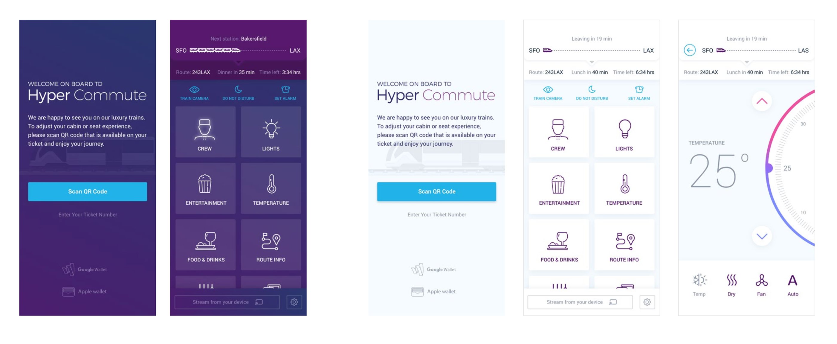
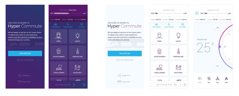
Start designing an experience with login, journey overview, cabin control (incl. temperature, lights, etc), and other luxury travel-related functions.
PROJECT GOALS
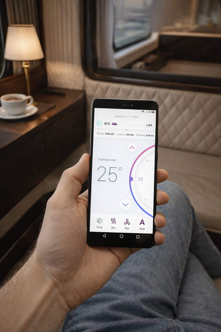
Instant control
Turn complex cabin systems into intuitive, familiar interactions that work immediately — no learning curve, no friction.
Right information, right time
Surface only what matters, precisely when it’s needed, to reduce cognitive load and support confident decision-making.
Calm by design
Create a premium, distraction-free experience that prioritizes clarity, reduces noise, and feels effortless for every passenger.

RESEARCH & INSPIRATION
Rather than reinventing interaction models, I built on patterns users already trust.
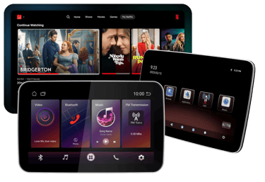
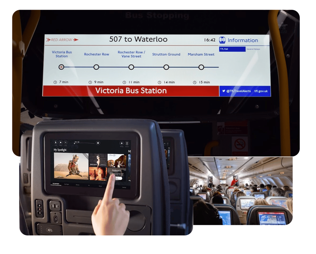
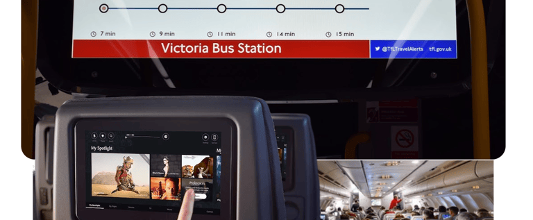
Mobility platforms like Trainline and Transit informed how complex journeys can be reduced to confident, step-based decisions. Smart home ecosystems such as Nest and Bose SoundTouch shaped the principle of instant, remote control with zero friction. Airline in-flight systems including Lufthansa and Turkish Airlines highlighted how to structure services in constrained environments. Luxury travel and future mobility concepts elevated the experience from purely functional to premium and anticipatory.
System Experience Audit
Overloaded dashboards that compete for attention instead of guiding it
01.
What doesn’t work
02.
Remote-control metaphors that add complexity instead of simplifying control
03.
Small typography and ambiguous icons that slow down recognition
04.
Multi-step settings for simple actions like adjusting the temperature
05.
Technical language that prioritizes system logic over human clarity
I evaluated the existing interaction patterns to identify friction points and scalable strengths.

The best similar apps experiences remove friction by reducing choice at the moment of action.
Clear day/night modes that adapt to context
01.
What works
02.
Large, tactile controls that encourage confident interaction
03.
Minimal steps to request service
04.
Predictive journey notifications that reduce uncertainty
05.
Entertainment seamlessly integrated with personal accounts (e.g., Netflix, music)


Rather than designing for a generic passenger, I defined a focused persona representing a modern luxury traveler — someone who values time, control, and a seamless premium experience.
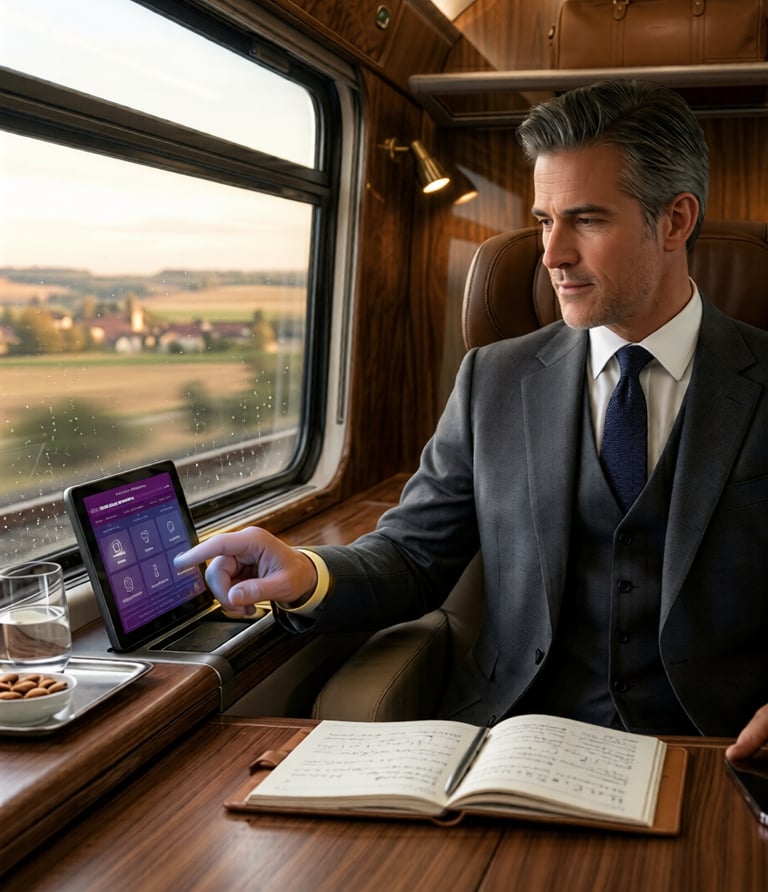
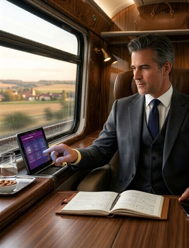
John is a 43 year old CEO frequent international traveler. He travels constantly and expects his environment to adapt to him. Efficiency, comfort, and discretion are essential.
John values the ability to stay productive during the journey, relax without interruptions, and receive important updates without constantly checking the system.
He becomes frustrated with clunky systems that require effort to use, multi-step actions for simple tasks like adjusting temperature or ordering service, and limited control over his environment and privacy.
FRUSTRATIONS
OPPORTUNITIES
The experience should prioritize one-tap access to essential controls, provide timely journey updates without requiring attention, and learn preferences to create a seamless “set-and-forget” environment.
JOHN — THE TIME DRIVE EXCECUTIVE

DEFINING PERSONA
CUSTOMER JOURNEY
Passengers interact with the system in short, task-focused moments rather than continuous browsing. Mapping the journey helped identify when control, information, and services are most valuable — from pre-boarding preparation to arrival.
These insights informed how the experience prioritizes instant access, minimal interaction, and timely notifications.
01.
02.
03.
04.
Before boarding
Passengers prepare their trip by exploring services, pre-ordering food, and setting expectations.
Allow pre-ordering and service discovery before the journey begins.
Design implication
Onboarding
A quick ticket scan unlocks the experience and provides immediate access to cabin controls and services.
Design implication
Remove account setup and enable instant login through ticket authentication.
During the journey
Passengers switch between relaxing, working, and requesting services, interacting with the system in short bursts.
Design implication
Prioritize large controls and one-tap actions for essential tasks.
Approaching destination
Design implication
Introduce proactive notifications for key journey moments.
Passengers need timely updates to prepare for arrival without actively checking the system.
05.
After arrival
Passengers reflect on the journey and may continue interacting with the service afterward.
Design implication
Extend the experience with feedback and personalized recommendations.
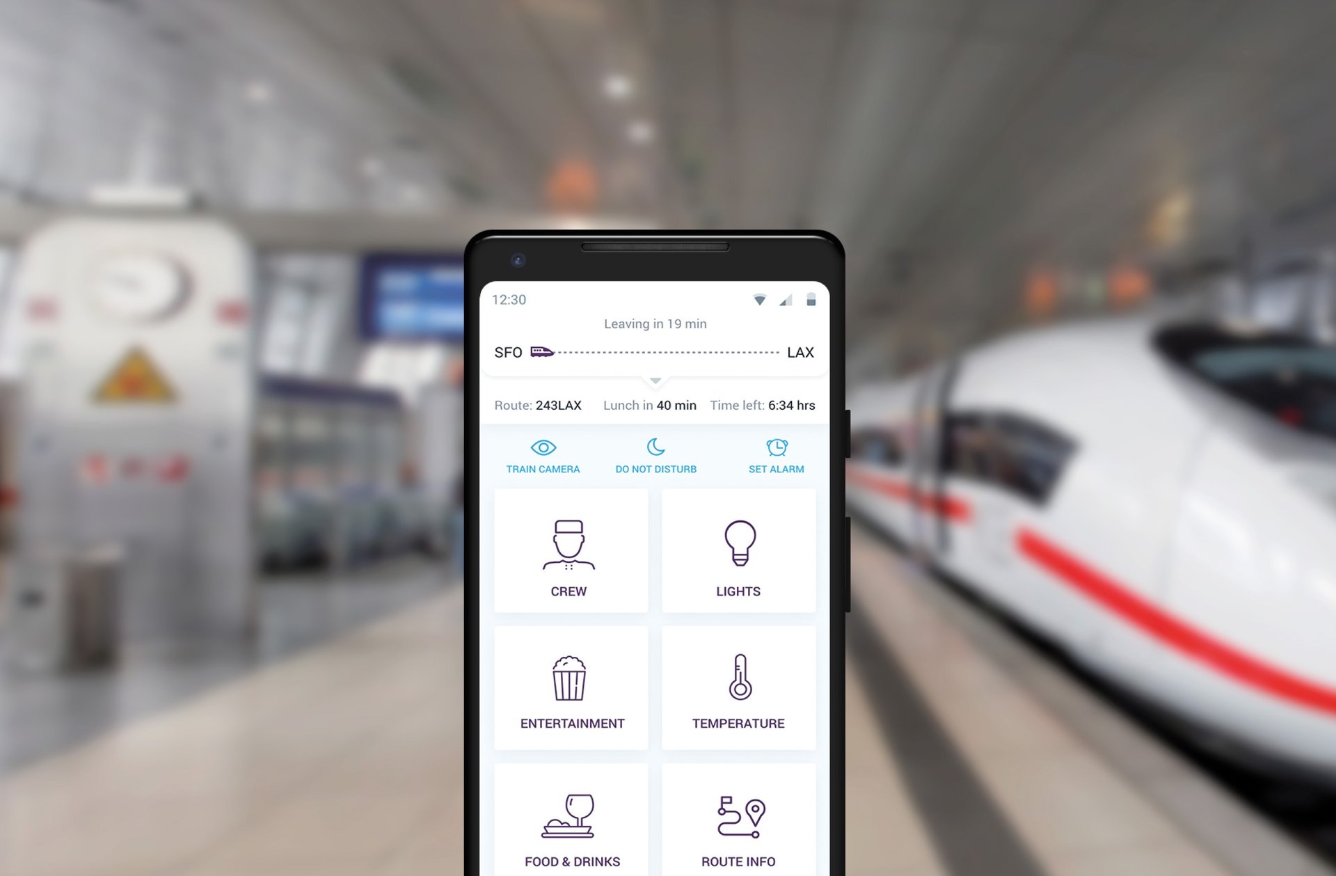
WIREFRAMES
Based on research and passenger journeys, I structured the app around core tasks rather than product features. The experience centers on four primary areas — cabin control, onboard services, journey information, and entertainment — ensuring passengers can reach any critical action in a single tap.
INFORMATION ARCHITECTURE
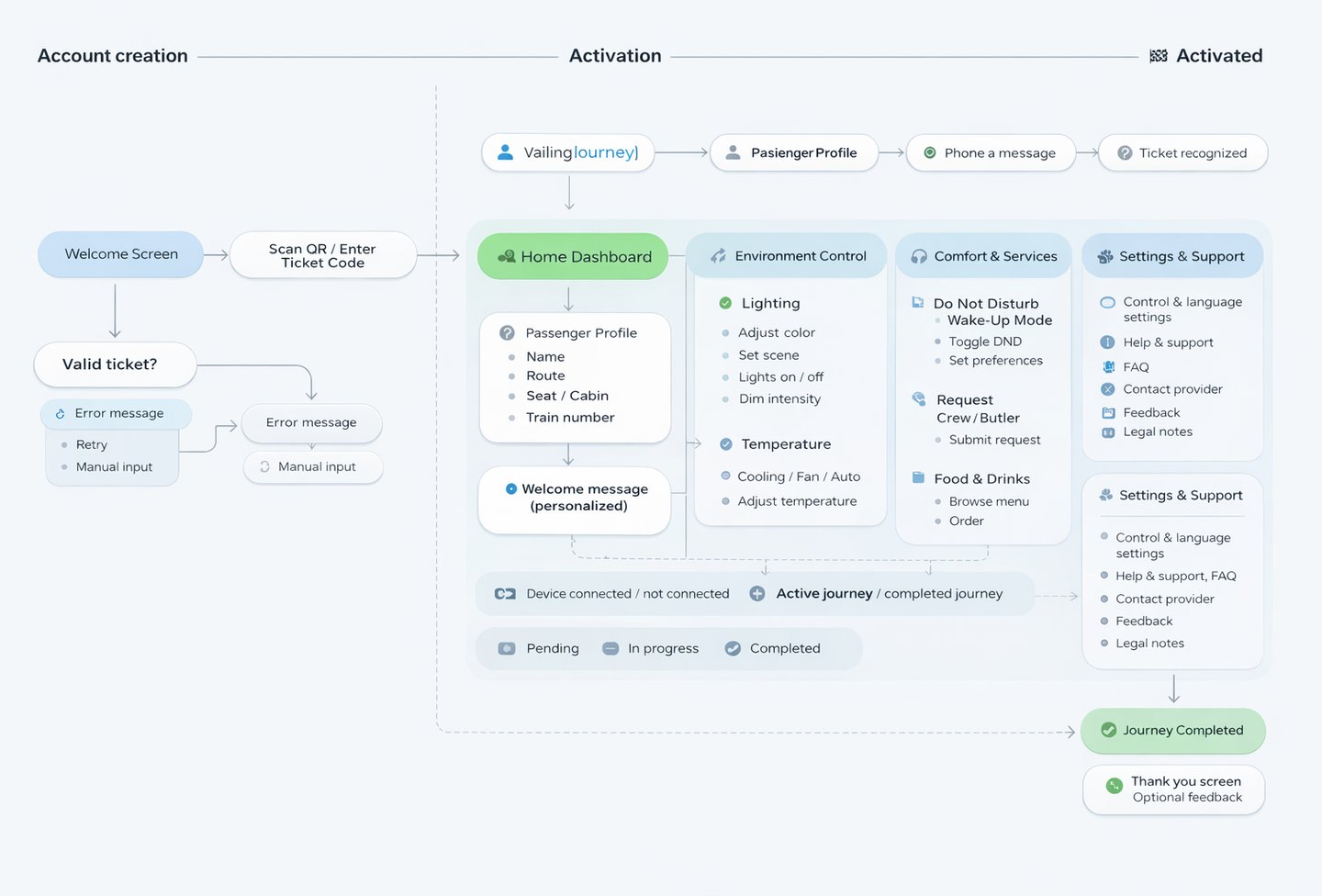
Before moving into visual design, I developed wireframes to validate the core interaction model, including primary navigation, control placement, and task hierarchy. I intentionally avoided complex gestures, focusing instead on clear affordances and familiar controls that passengers can understand instantly.
Design principle
Critical actions should always be reachable with one tap.
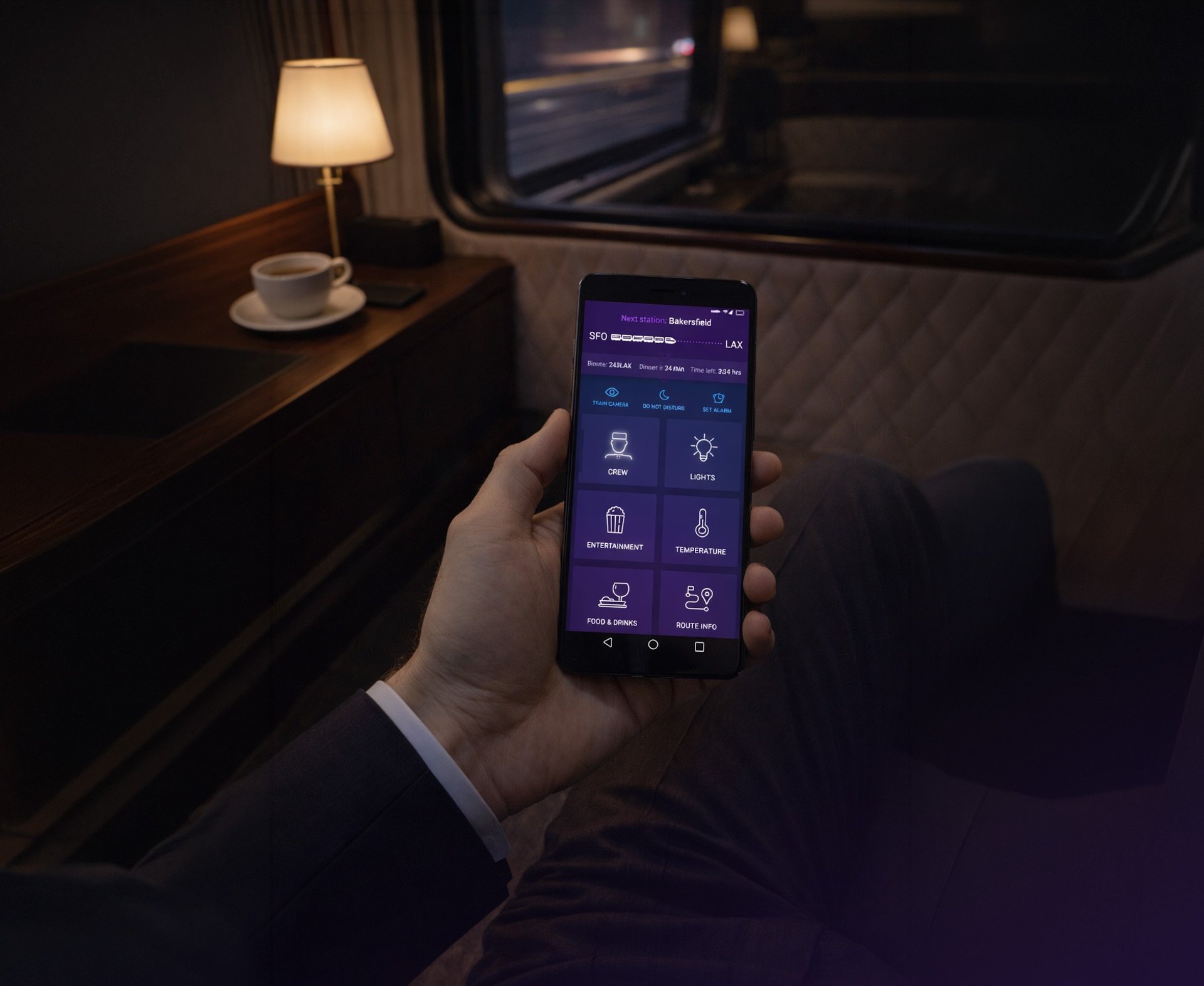
Visual Design & User Interface
COLOR & TYPOGRAPHY
A palette of deep purples and refined blues establishes a sense of luxury, trust, and calm, while light neutrals maintain clarity across information-rich screens. Montserrat and Roboto create a balanced typographic system — elegant headlines paired with highly readable interface text.
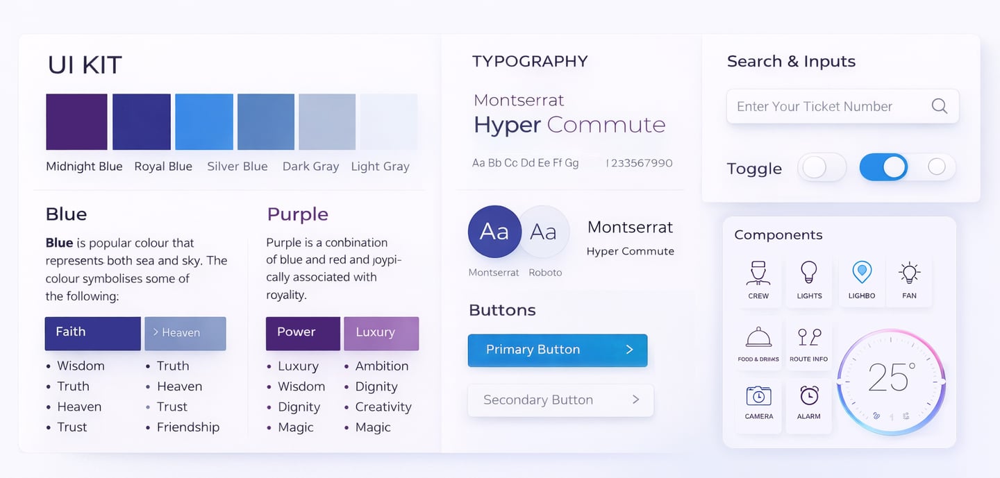
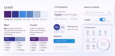
DESIGN LANGUAGE
The interface moves beyond standard Material patterns toward a more refined, premium aesthetic. Generous spacing, subtle contrast, and calm visual hierarchy create a tailored experience while maintaining familiarity across iOS and Android.
A calm, premium visual system designed for clarity and effortless interaction.
Rail evolves from transportation infrastructure into a premium, experience-driven ecosystem - increasing satisfaction, trust, retention, and long-term brand value.
RESULTS
The Impact
Ambient-aware dark UI, cinematic route visualizations, and cabin previews elevated the perception of rail travel, while clear hierarchy and minimal CTAs reduced cognitive load, cutting the average task time by an estimated 40%.
By unifying booking, cabin controls, entertainment, and journey tracking into a single ecosystem, passengers now enjoy a “set-and-forget” experience, with key actions accessible with one tap and system interactions reduced by 50%.
A simpler, more intuitive experience that elevates the perception of rail travel.
OVERALL IMPACT
40%
Faster task completion
Clear hierarchy, minimal CTAs, and context-aware modules reduced the average time passengers spend interacting with the system.
50%
By unifying booking, cabin controls, entertainment, and journey tracking, key actions are now accessible in one tap, creating a seamless, “set-and-forget” experience.
Fewer interactions needed