
WalletHub
Helping people in the US to make better financial decisions
WalletHub is a U.S.-based personal finance platform that helps millions of people compare financial products and make everyday money decisions.
Its growth depends heavily on clarity, trust, and helping users understand complex information quickly.
CLIENT
PRODUCT
PLATFORM
TIMELINE
WalletHub
Personal finance platform
2016 - 2018
Web & iOS + Android
This case study contains information from work completed under non-disclosure agreements (NDA). Sensitive details have been modified or omitted to respect confidentiality obligations. The content represents my personal analysis and work contributions, and does not necessarily reflect the views or positions of WalletHub.
CONFIDENTIALITY NOTICE

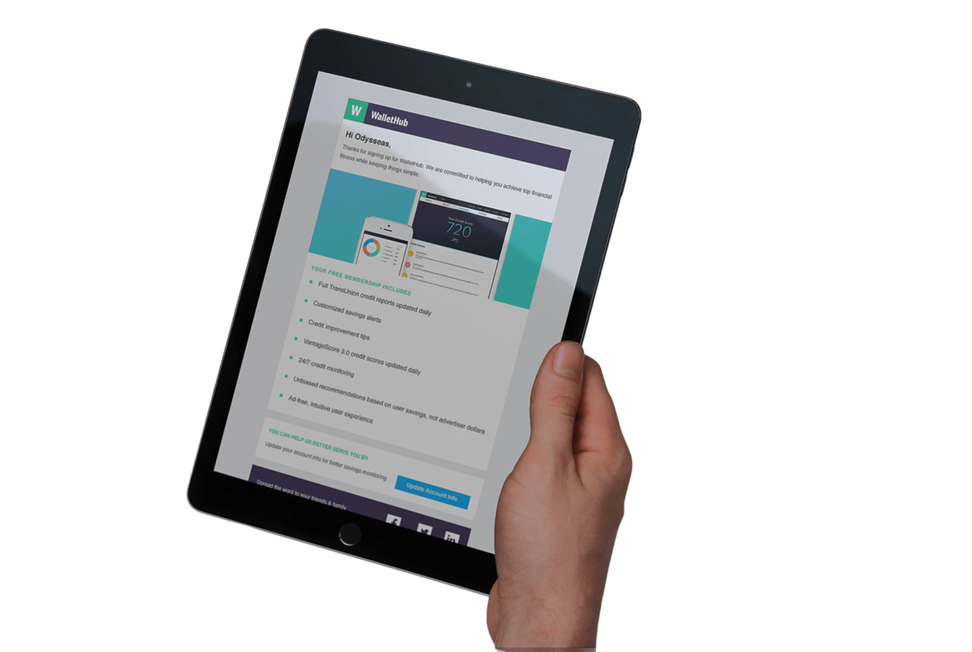
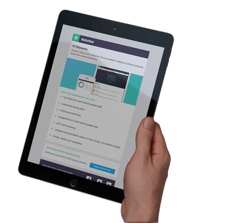
I led UX across multiple initiatives spanning growth and product. My work included improving high-traffic entry points, designing financial tools, shaping insurance experiences, and contributing to the mobile app used by millions.
I worked closely with product managers, analysts, and engineers throughout, helping align user needs with business goals while keeping the experience clear and consistent.
MY ROLE
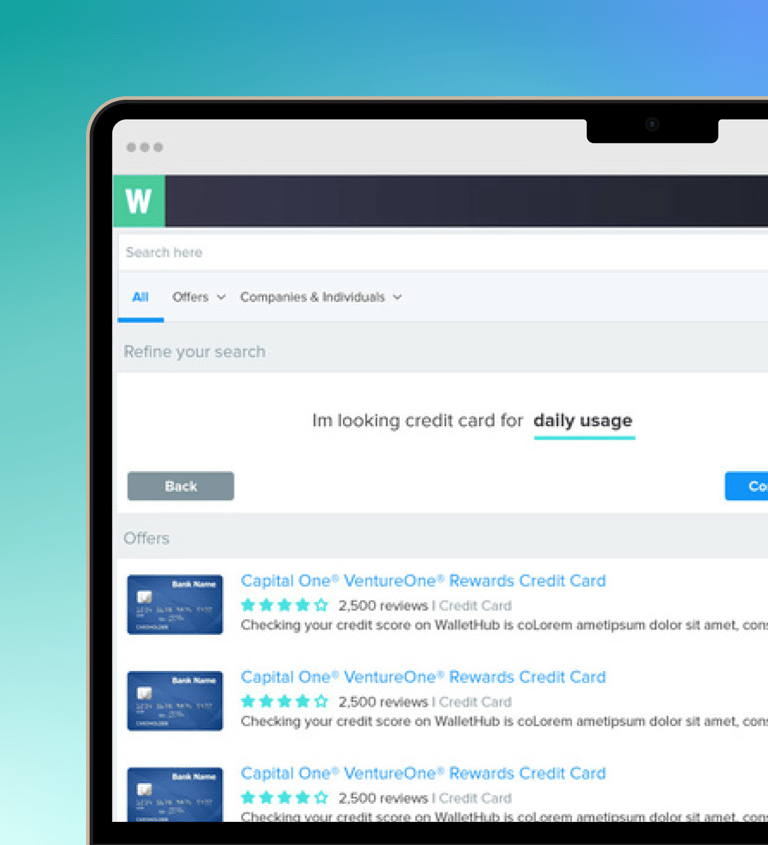
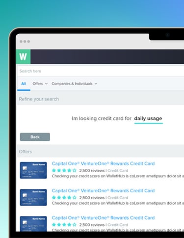
Comparing options.
Users actively choosing between credit cards, loans, or insurance plans who needed quick clarity.
Designing for these groups meant balancing speed, clarity, and explanation across the experience.
Managing finances. Returning users tracking credit health and looking for ways to improve over time.
Still learning.
Less experienced users who needed guidance through complex topics.
USERS BASE
WalletHub supports a wide range of users making different kinds of financial decisions.
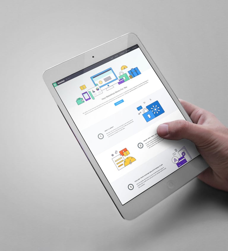
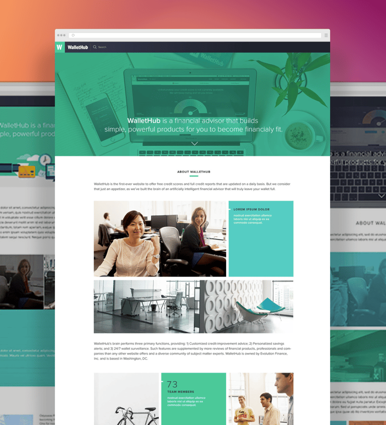
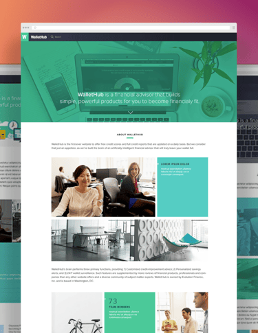
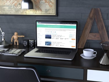
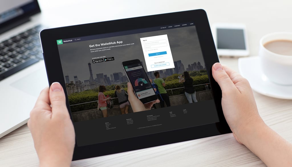
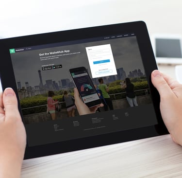
LANDING & OTHER PAGES
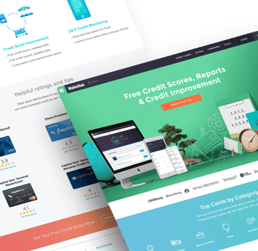
Making entry decisions clearer
I worked on improving high-traffic entry web-pages that introduced users to financial products and tools.
High-traffic entry pages were cluttered and unclear, making it harder for users to understand options and move forward.
PROBLEM

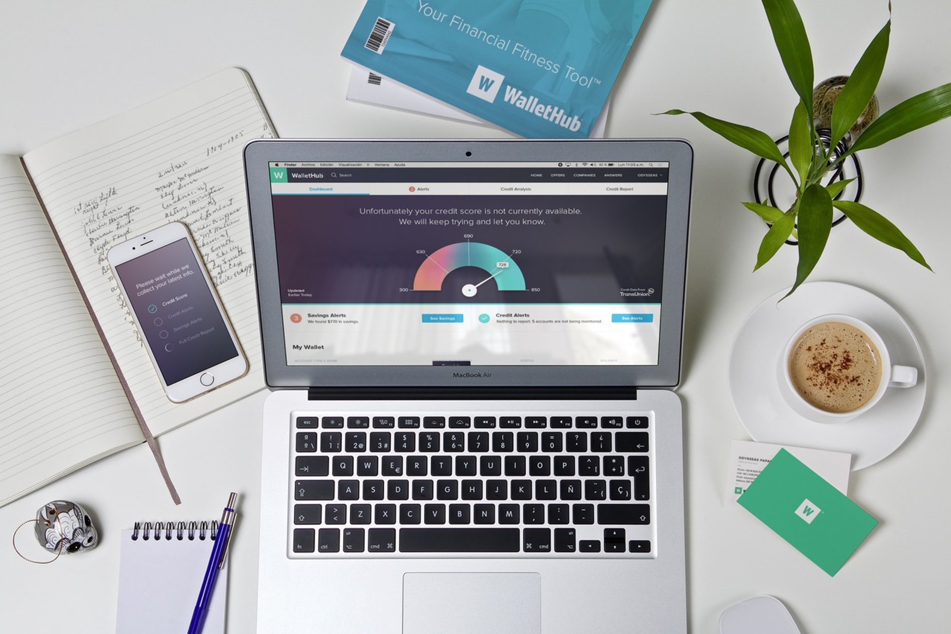

Balancing business priorities on high-traffic entry pages while reducing friction and making key decisions easier and faster for users.
CHALLENGE
We continuously tested layout, messaging, and hierarchy variations to validate decisions and improve performance across key pages.
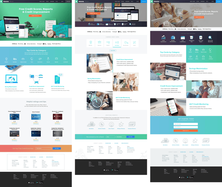
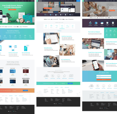
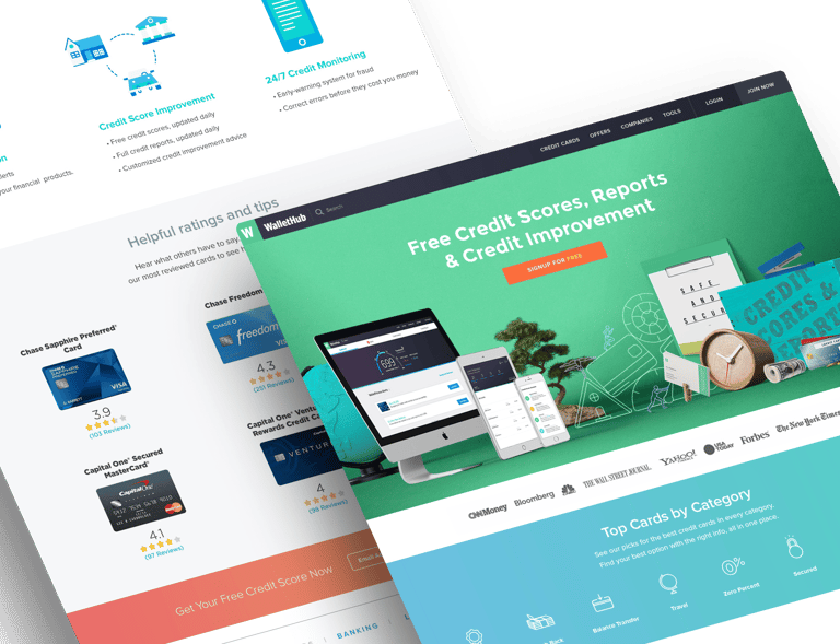
Improving first decisions
SOLUTION
Clearer hierarchy. Simplified layouts so key actions stood out immediately, and users could move forward without hesitation.
Less visual noise. It reduced competing elements and tightened the structure to make scanning faster and easier.
Tools earlier. Brought search and comparison tools forward to support quicker decision-making.


TAKEAWAY & RESULTS
Increase in clicks to comparison and tool pages
Reduction in early drop-off across key entry flows
14%
33%
Simplifying structure and focusing on clarity had the biggest impact on both engagement and conversion.
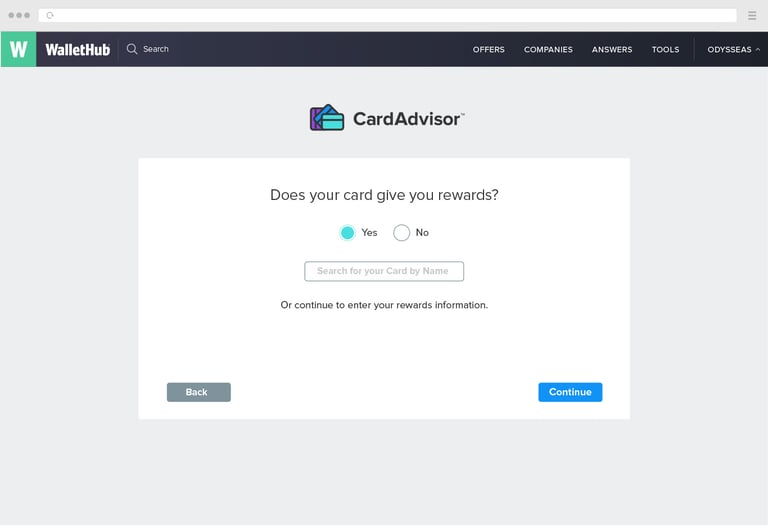
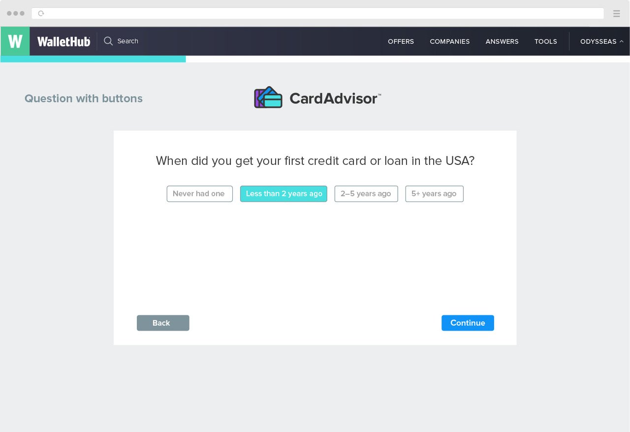
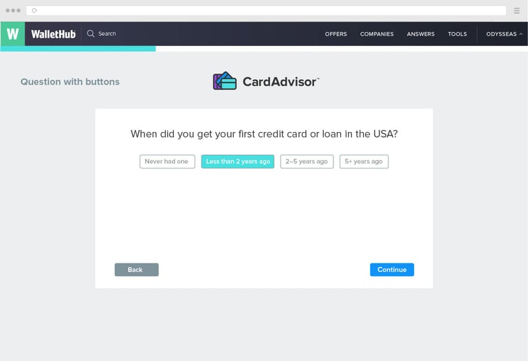
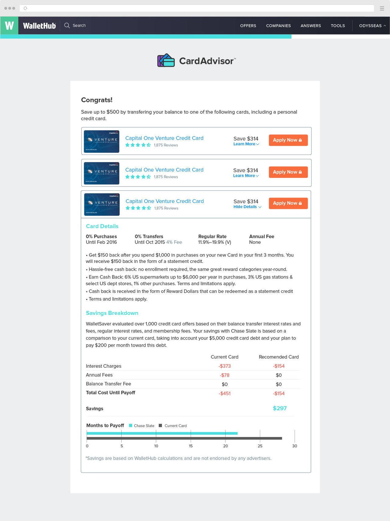
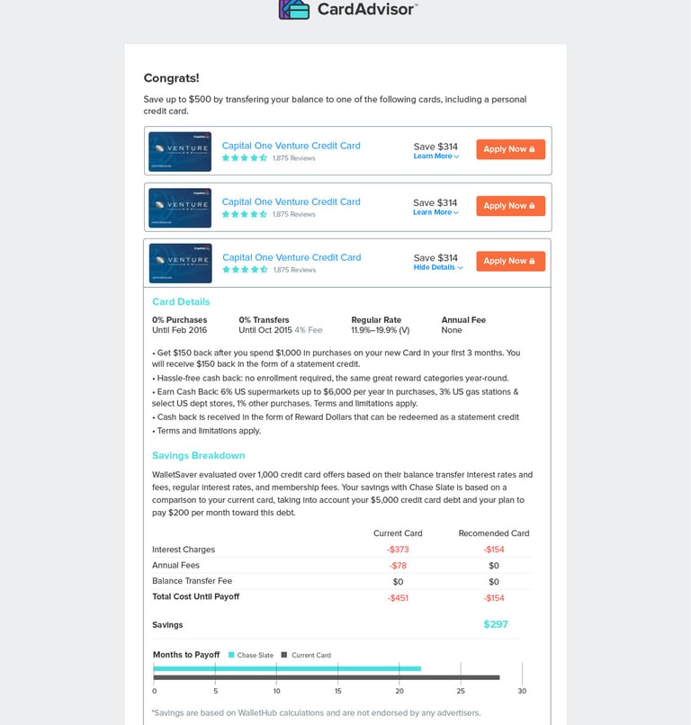
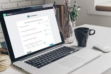
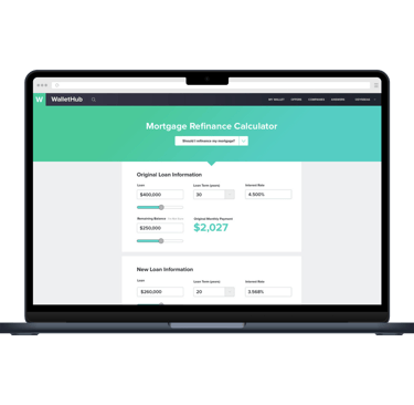
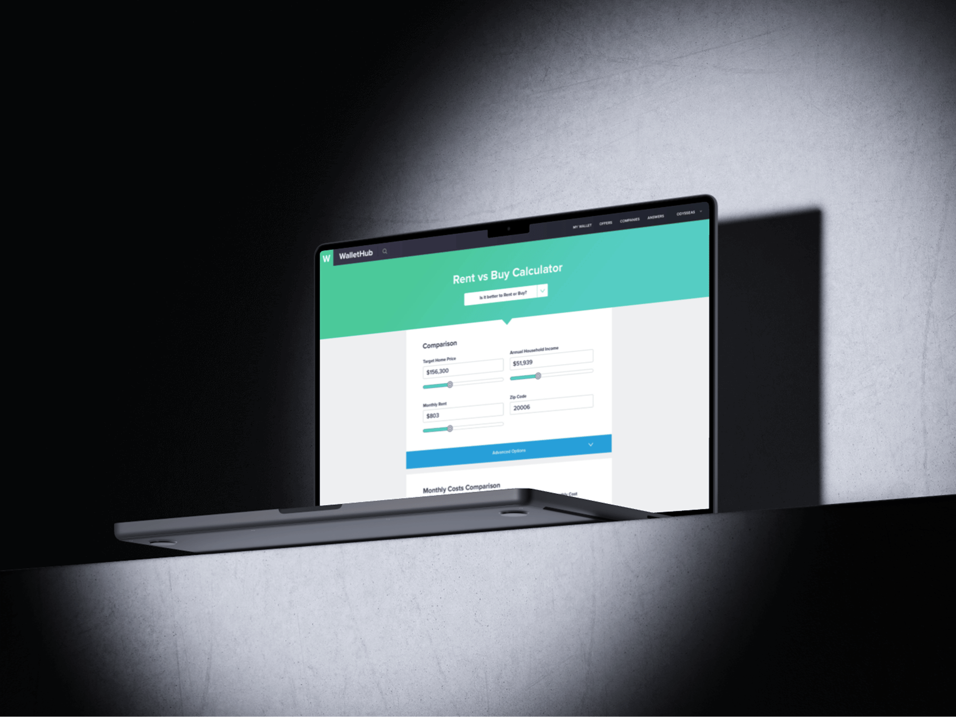
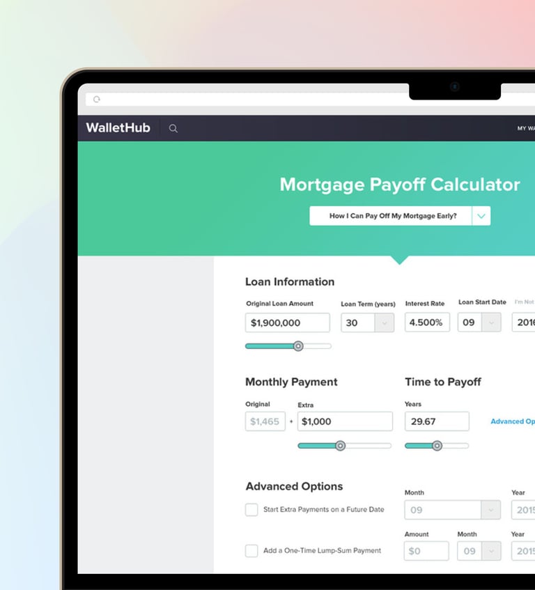
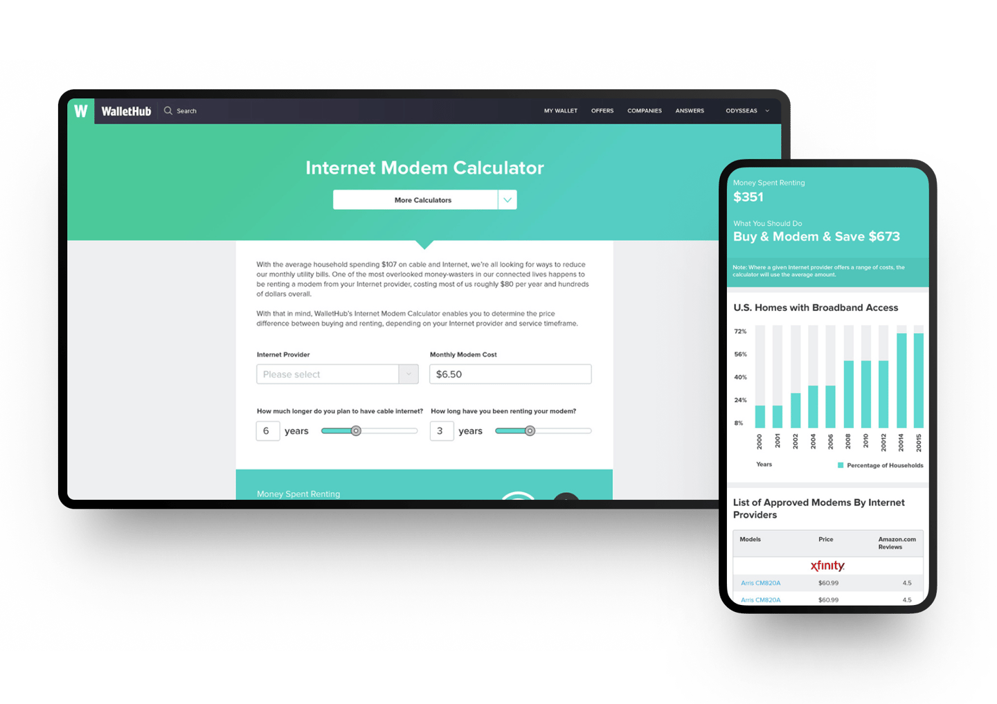
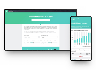
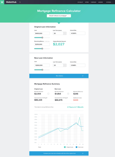
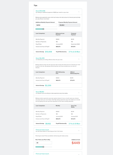
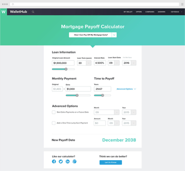
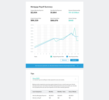
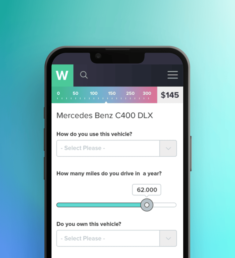
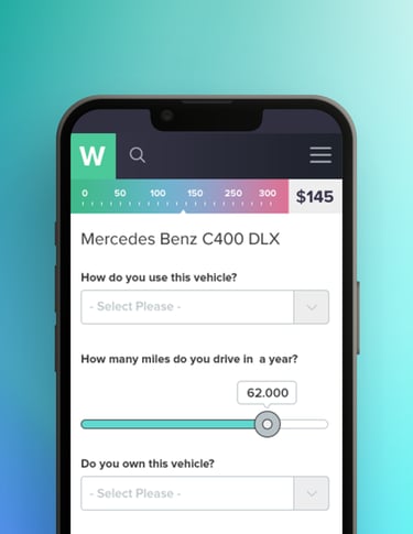
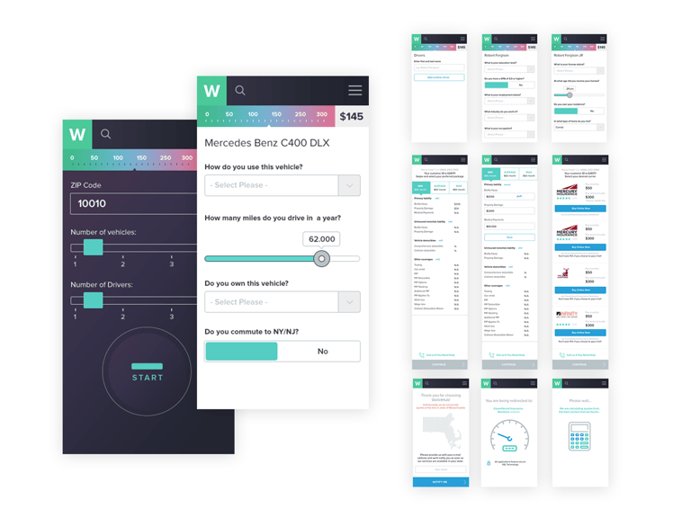
CALCULATOR
Simplifying financial tools
I led design across multiple financial calculators used throughout acquisition and engagement journeys.
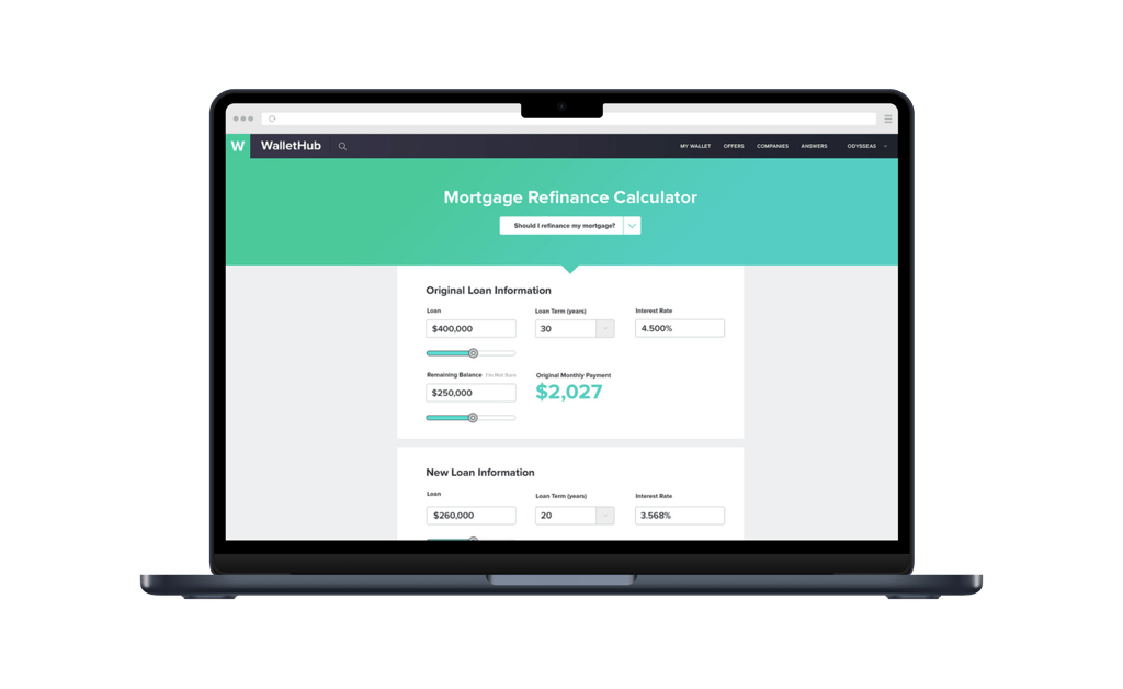
We saw that calculators were inconsistent, difficult to complete, and hard to understand, leading to drop-off across flows.
PROBLEM


Standardizing complex tools while keeping them simple, clear, and easy to use across different use cases.
CHALLENGE
Simplifying calculator experiences
SOLUTION
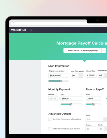
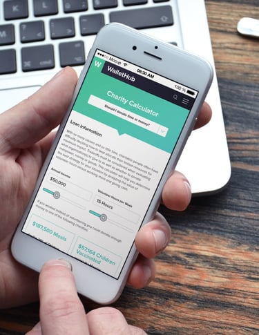
Simpler input. Streamlined input structures so users could complete calculations with less effort.
Step-by-step flow. Used progressive disclosure to reduce overwhelm and guide users through each step.
Clearer results. We clarified outputs and built reusable patterns across tools for consistency.


TAKEAWAY & RESULTS
Improvement in completion rates across key calculator flows
Increase in traffic driven by calculators
14%
33%
Designing calculators as consistent, repeatable tools improved both usability and long-term scalability.
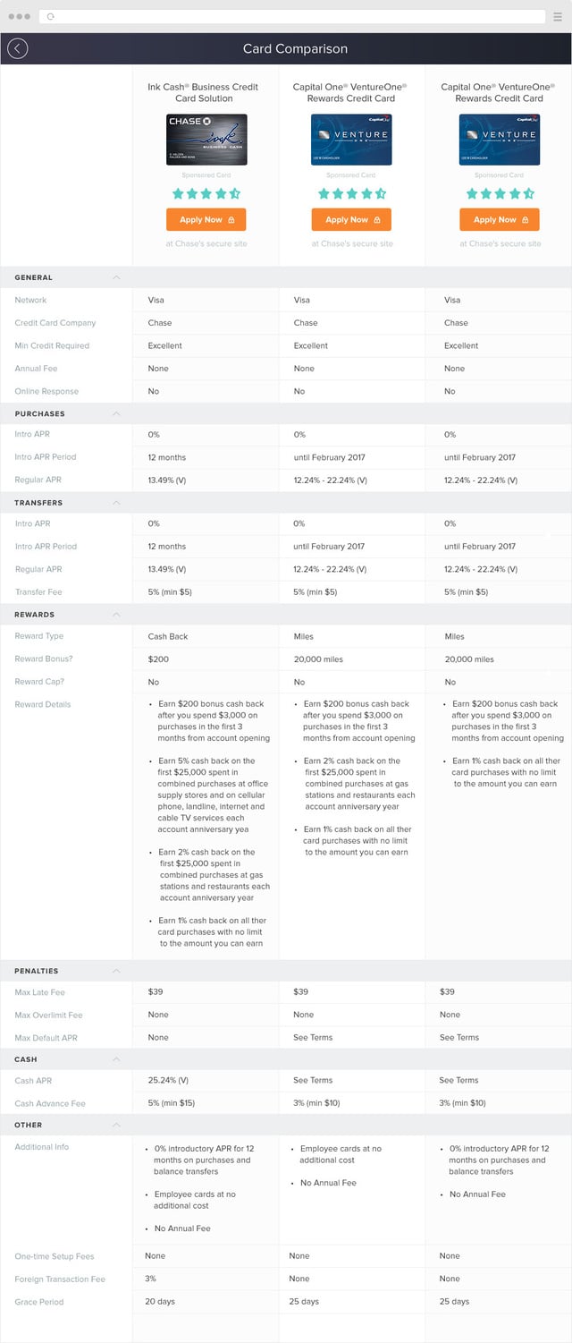
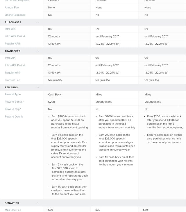
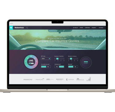
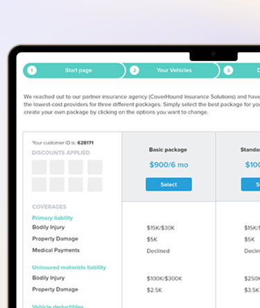
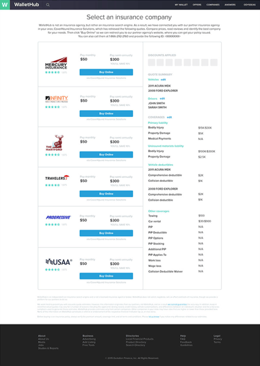
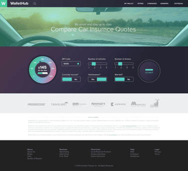
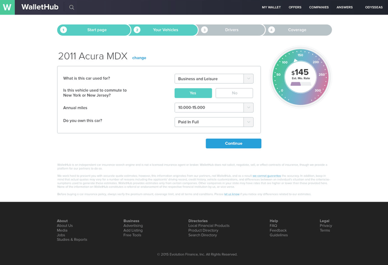
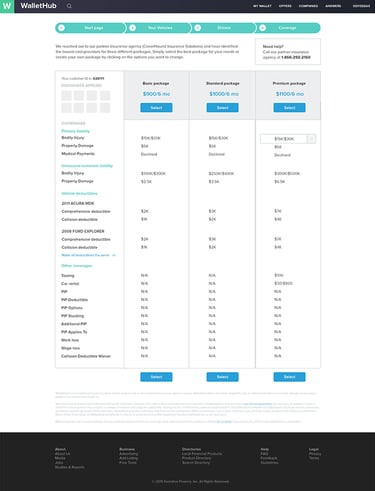
CAR INSURANCE
Improving insurance comparisons
I designed comparison experiences for car insurance — one of the most complex and high-stakes categories on the platform.
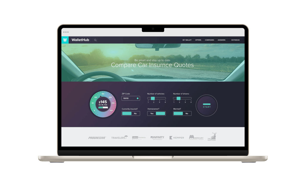
Dense information and unclear comparisons made it difficult for users to evaluate providers and choose coverage confidently.
PROBLEM


Making complex insurance options easier to compare while supporting both quick decisions and deeper evaluation.
CHALLENGE
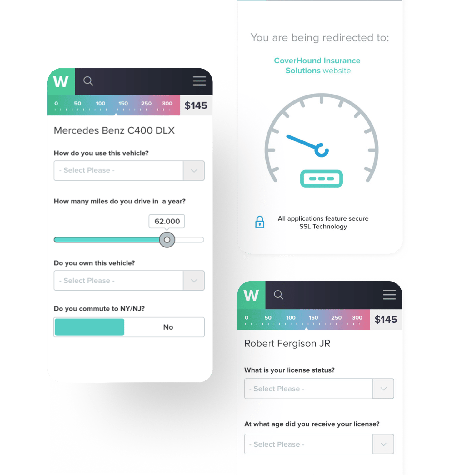
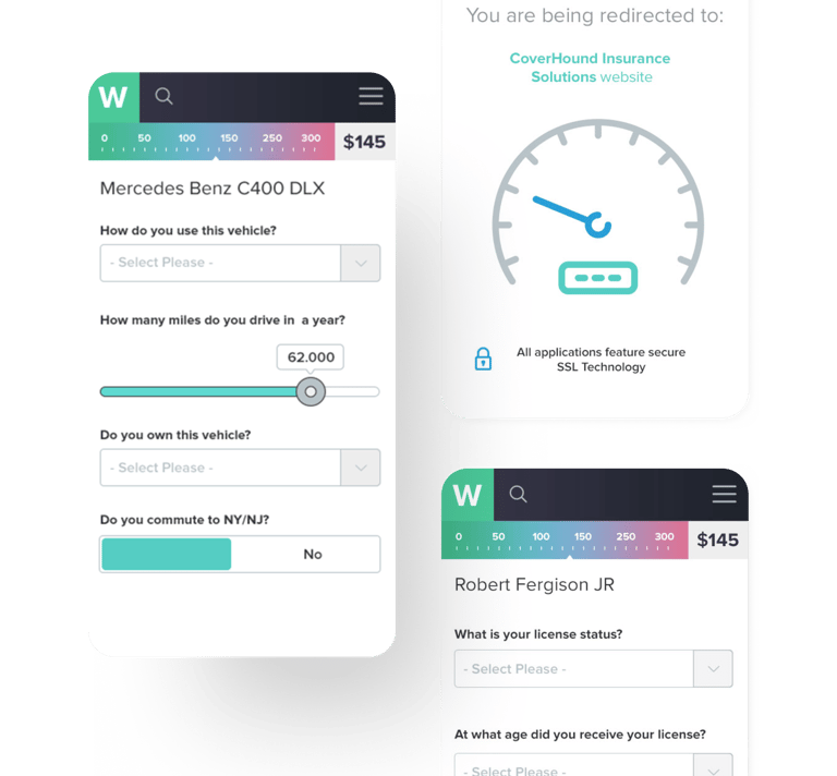
Clarifying insurance comparisons
SOLUTION
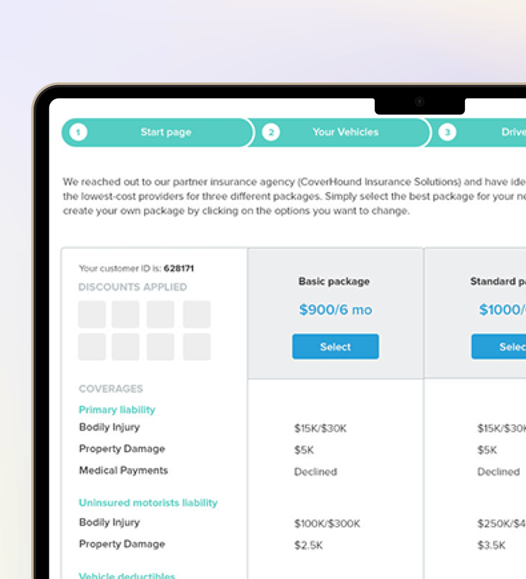
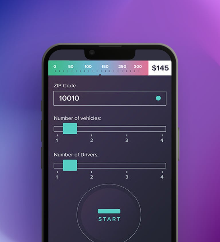
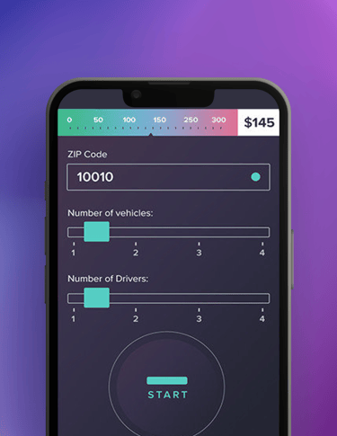
Clearer structure. We organized information into clearer sections so users could scan and compare options more easily.
Stronger comparison. We improved comparison tables to highlight meaningful differences across providers.
Reduce friction. We simplified flows to support both quick decisions and deeper exploration.


TAKEAWAY & RESULTS
Increase in engagement across comparison tables
Reduction in abandonment across insurance flows
11%
10%
Clear comparisons and structured information had the biggest impact on decision confidence.
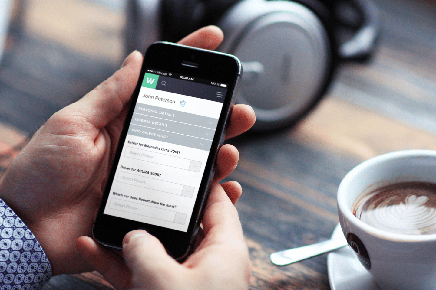
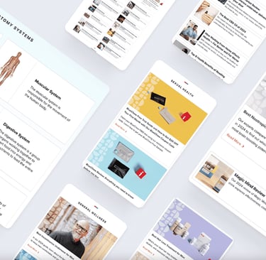
APPLICATION
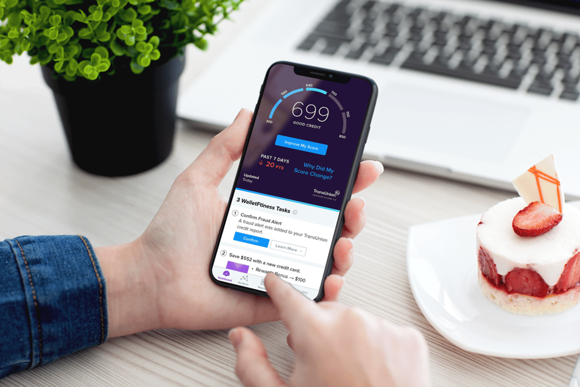
Designing for mobile
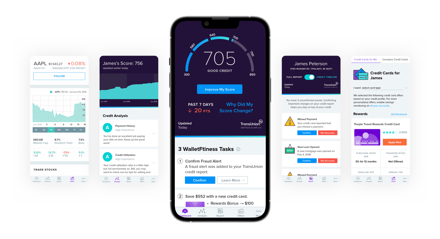
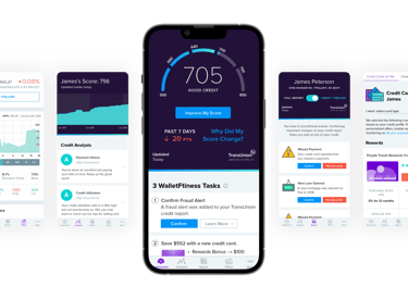
I contributed to the design of the award-winning WalletHub’s mobile app used by over 2 million people, helping translate complex financial data into clear, actionable insights.
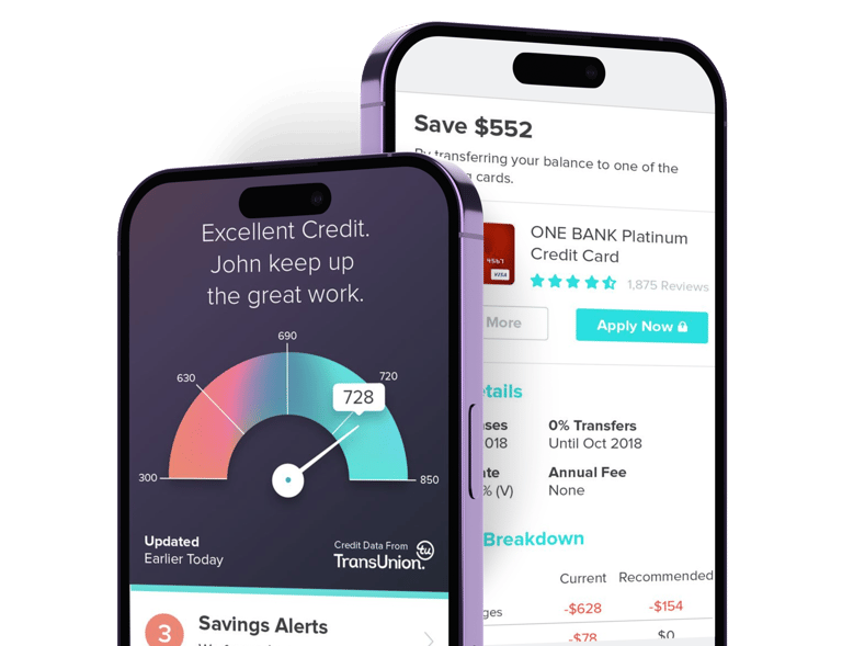
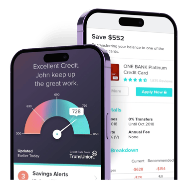


We saw that financial data was hard to interpret on mobile, and key features lacked clarity and consistency.
PROBLEM

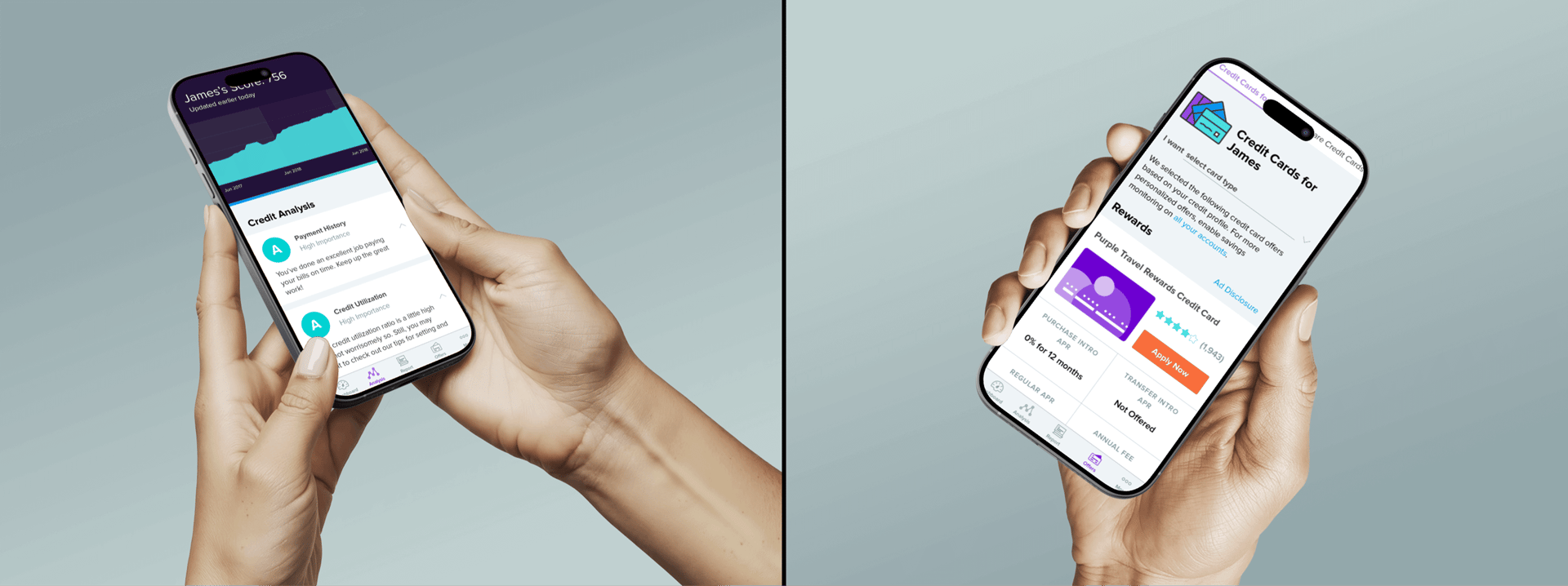

Translating complex financial information into a clear, consistent, and actionable mobile experience.
CHALLENGE
Making financial insights clearer
SOLUTION

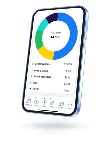
Better data visibility. We designed clearer visualization patterns to help users quickly understand their financial standing.
Stronger engagement flows. Improved how users navigate between insights, monitoring tools, and actions.
Cross-platform consistency. We aligned mobile experiences with core product patterns used across the platform.

TAKEAWAY & RESULTS
Increase in repeat usage across key app features
Increase in engagement with credit monitoring tools
21%
17%
Clear data visualization and focused interaction flows helped turn complex financial data into actionable insights.
NEXT CASE STUDY
Health & Wellbeing