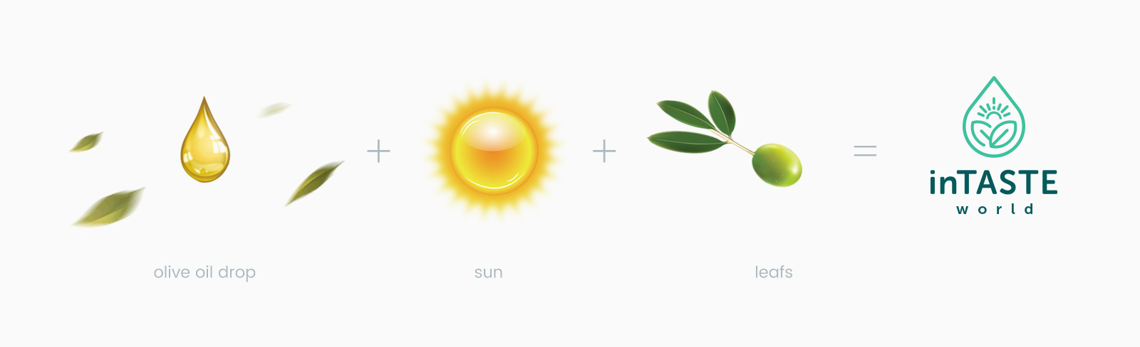
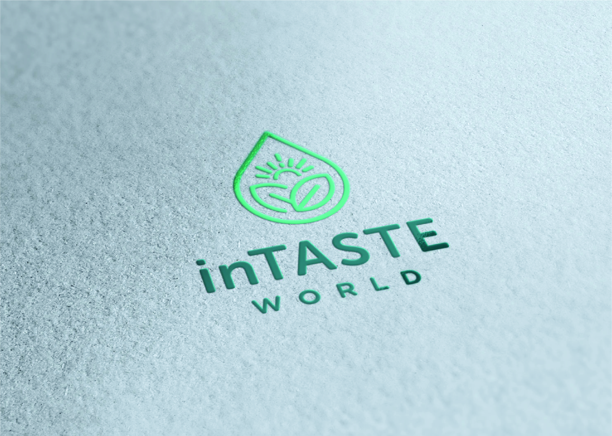
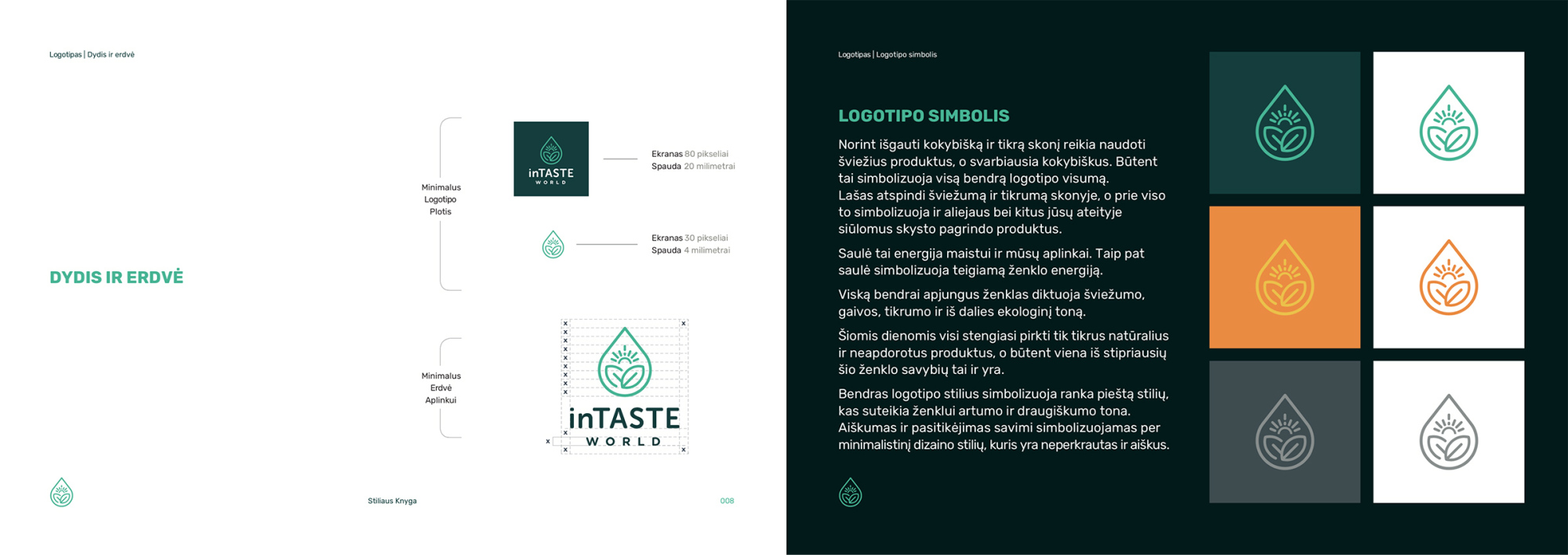
When I was designing this logo mark, I was inspired by the fact that the brand is all about eco, pure and natural products. This gave me the idea for water or olive oil drop which I combined together with sunshine which represents energy and added leaves of olives or just grass. As you can see the result was outlined logo mark with the nicely paired font.
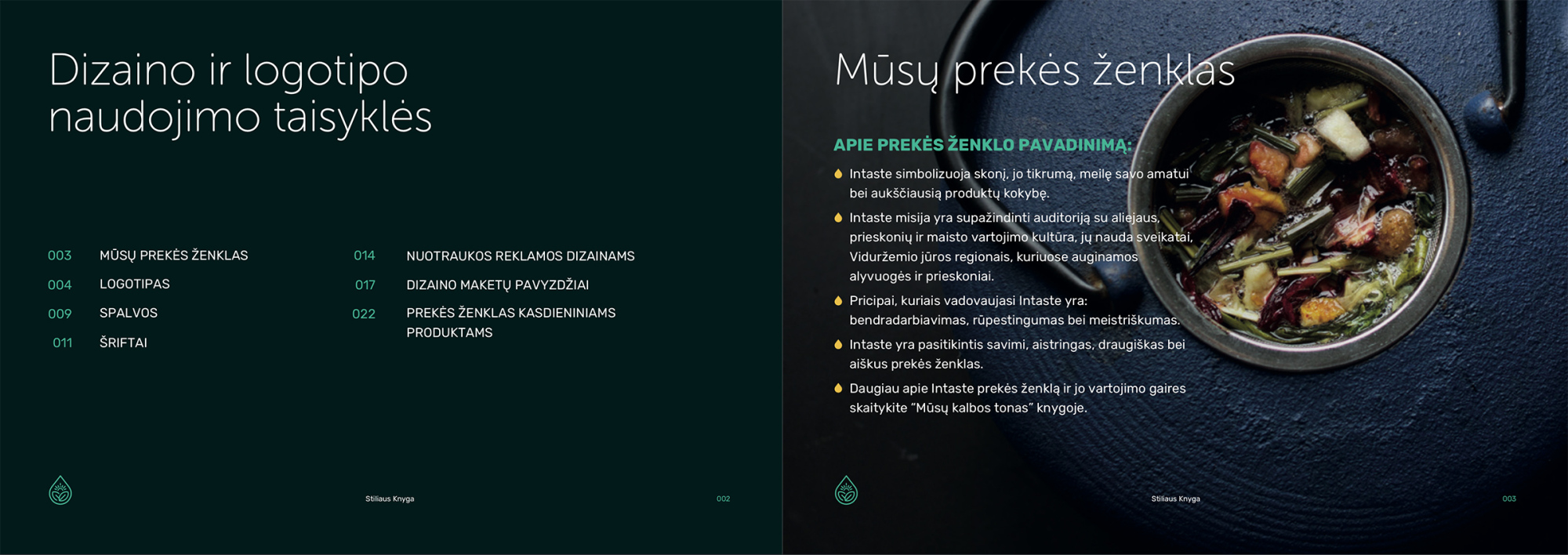
inTASTE symbolizes taste, its authenticity, love for its craft, and the highest quality of products. The mission of inTASTE is to familiarize the audience with the culture of oil, spice and food consumption, their health benefits, the Mediterranean regions where olives and spices are grown. The principles that guide Intaste are collaboration, care, and excellence. inTASTE is a self-confident, passionate, friendly and clear brand.
In order to obtain a high quality and genuine taste, fresh products should be used, and above all qualitative ones. This is what symbolizes the whole of the logo as a whole. The drop reflects freshness and certainty in the skewer and is symbolized by oil and other liquid-based products in your future. The sun is the energy for food and our environment. The sun also symbolizes the positive energy of the sign. By combining everything, the sign dictates the freshness, freshness, certainty and, in part, the green tone. These days, everyone is trying to buy only genuine natural and unprocessed products, and that is one of the most reliable features of this brand. The overall style of the logo symbolizes a hand-drawn style that gives the mark a ton of closeness and friendliness. Clarity and self-confidence are expressed through a minimalist design style that is untranslated and clear.
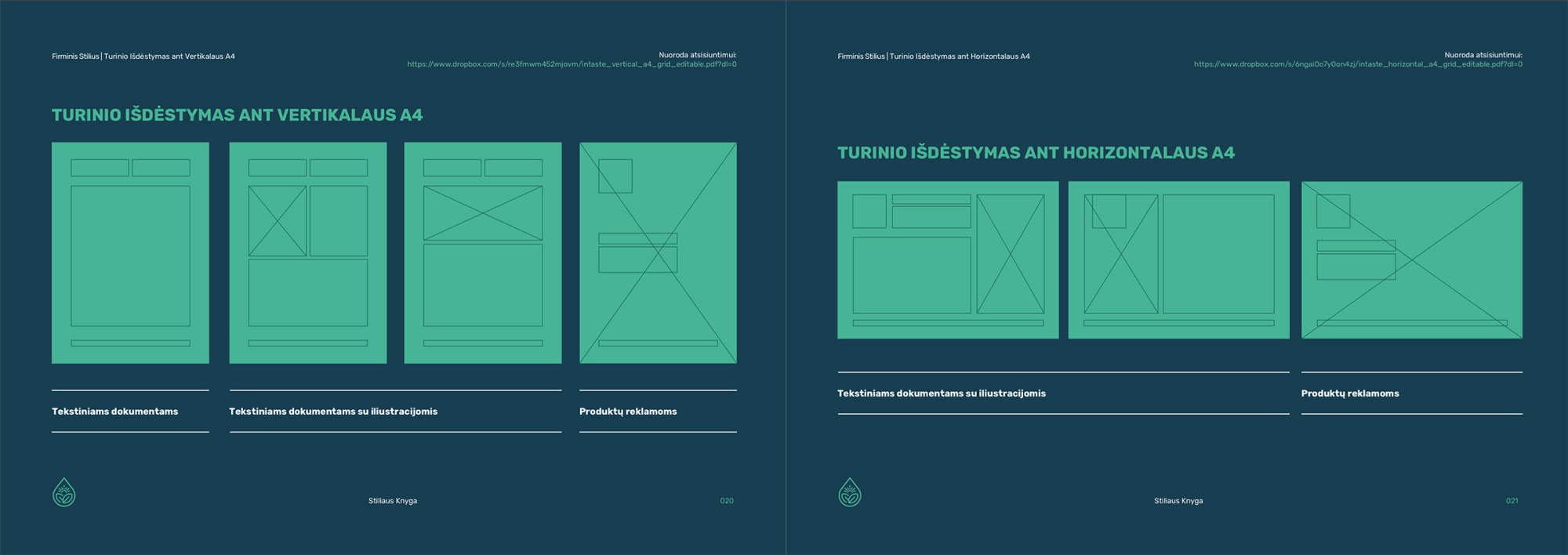
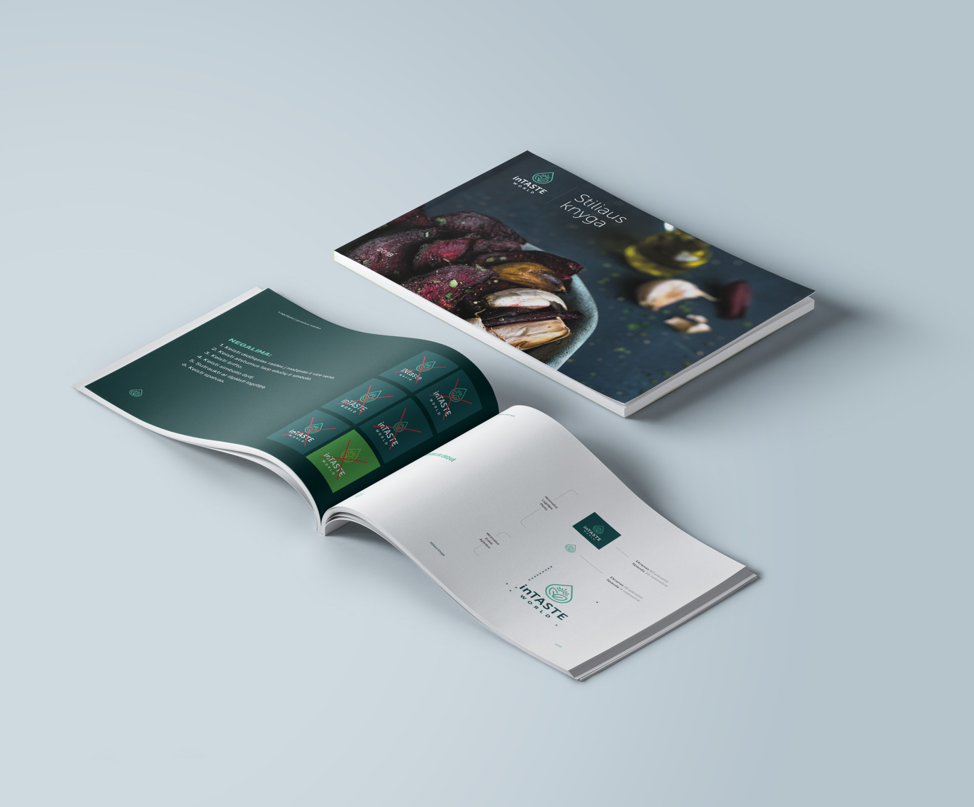
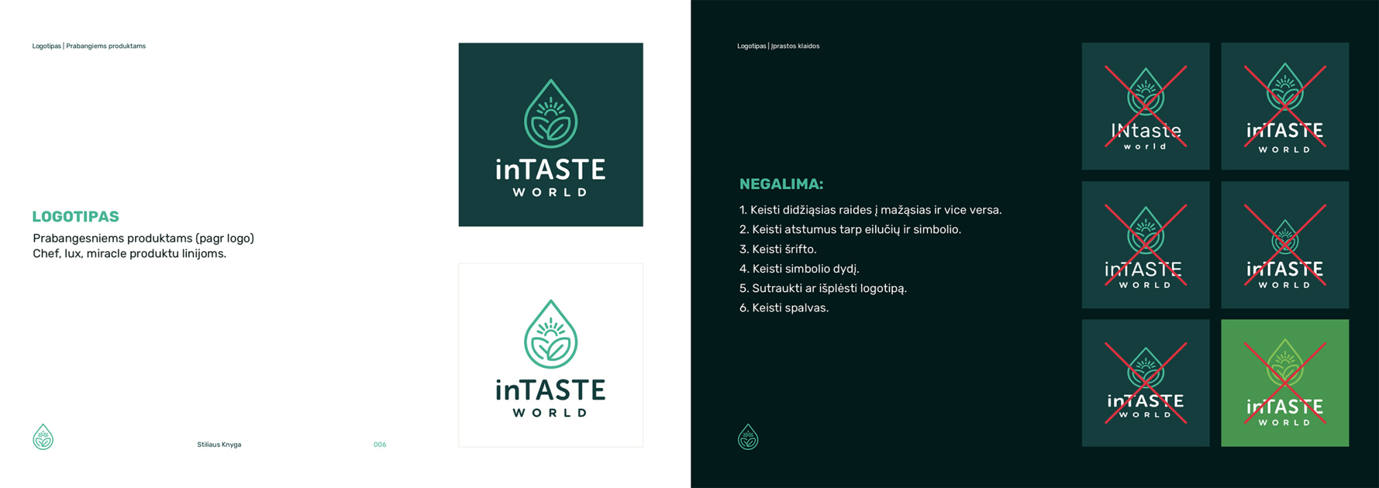
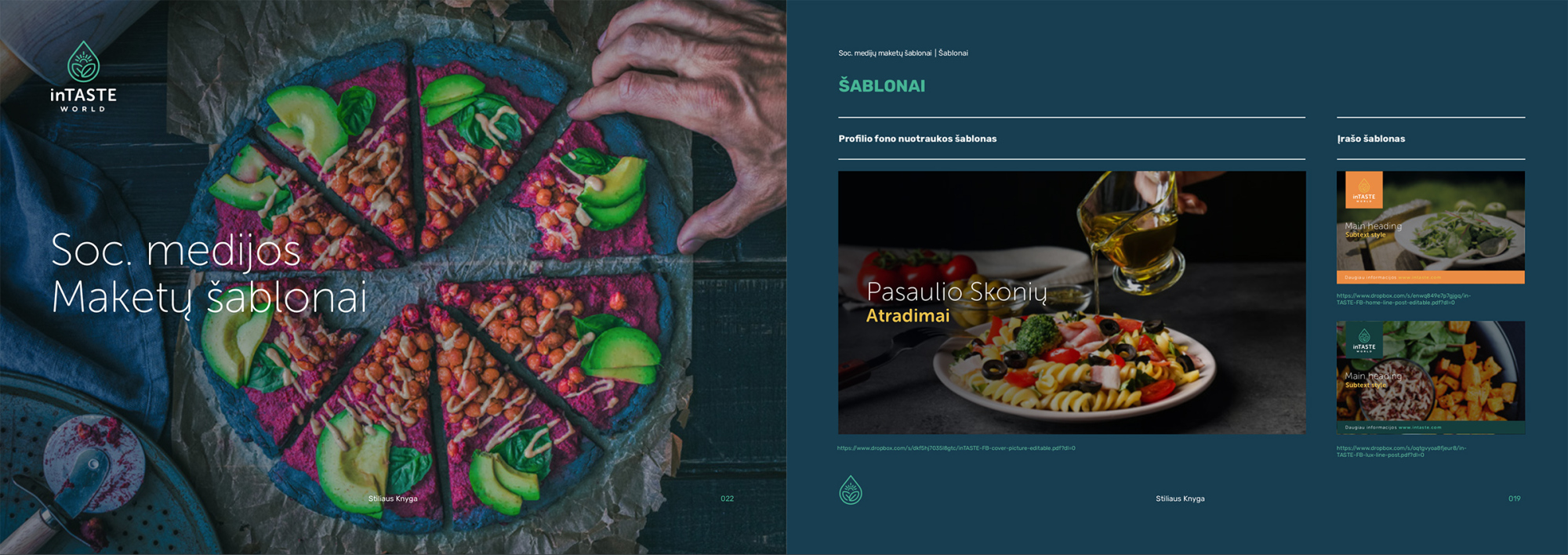
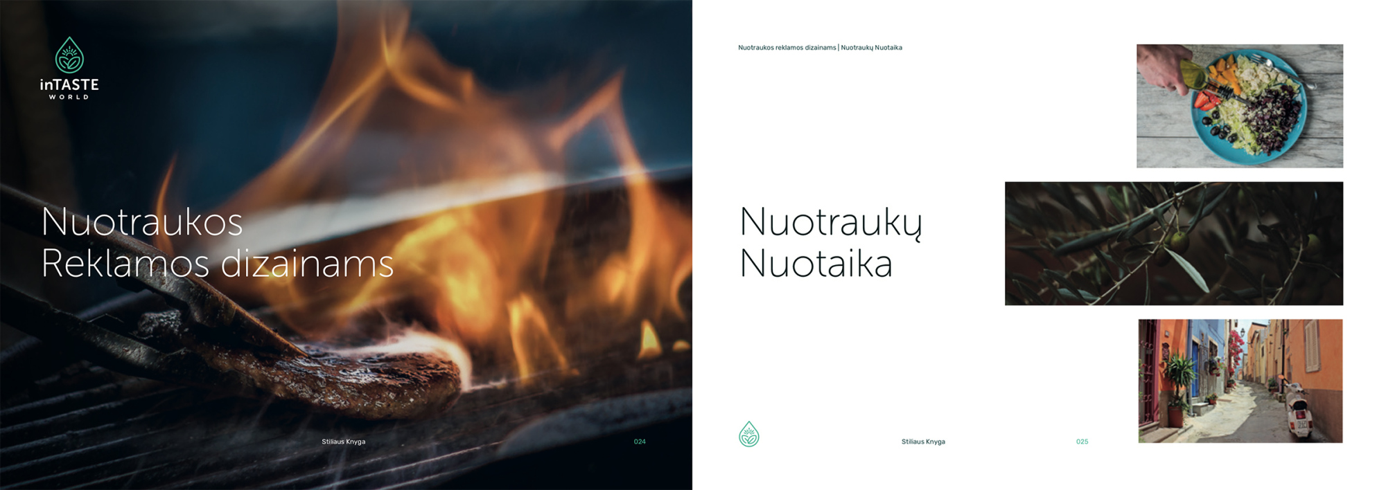
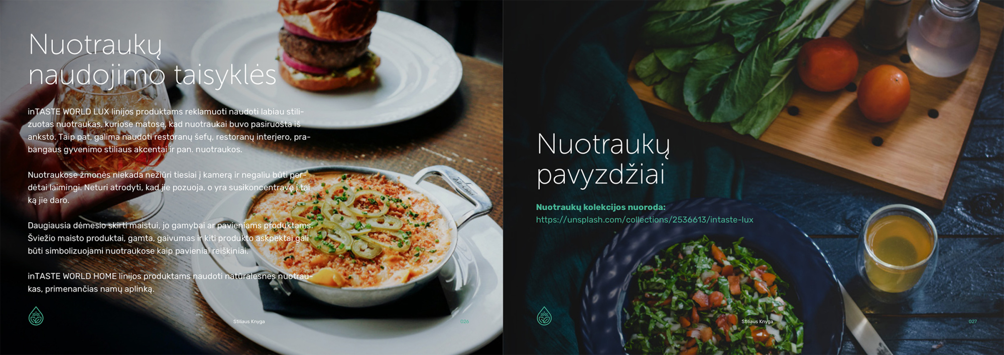
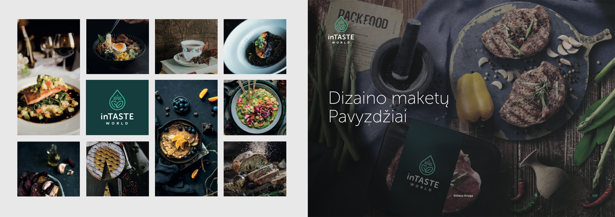
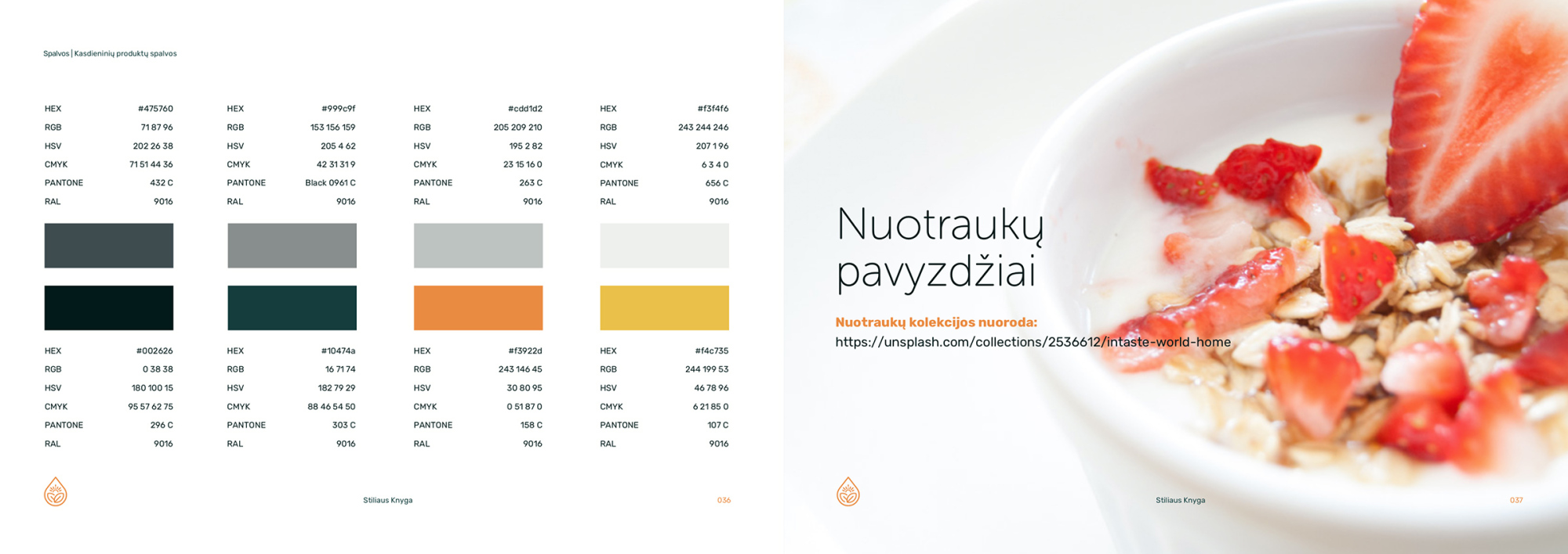
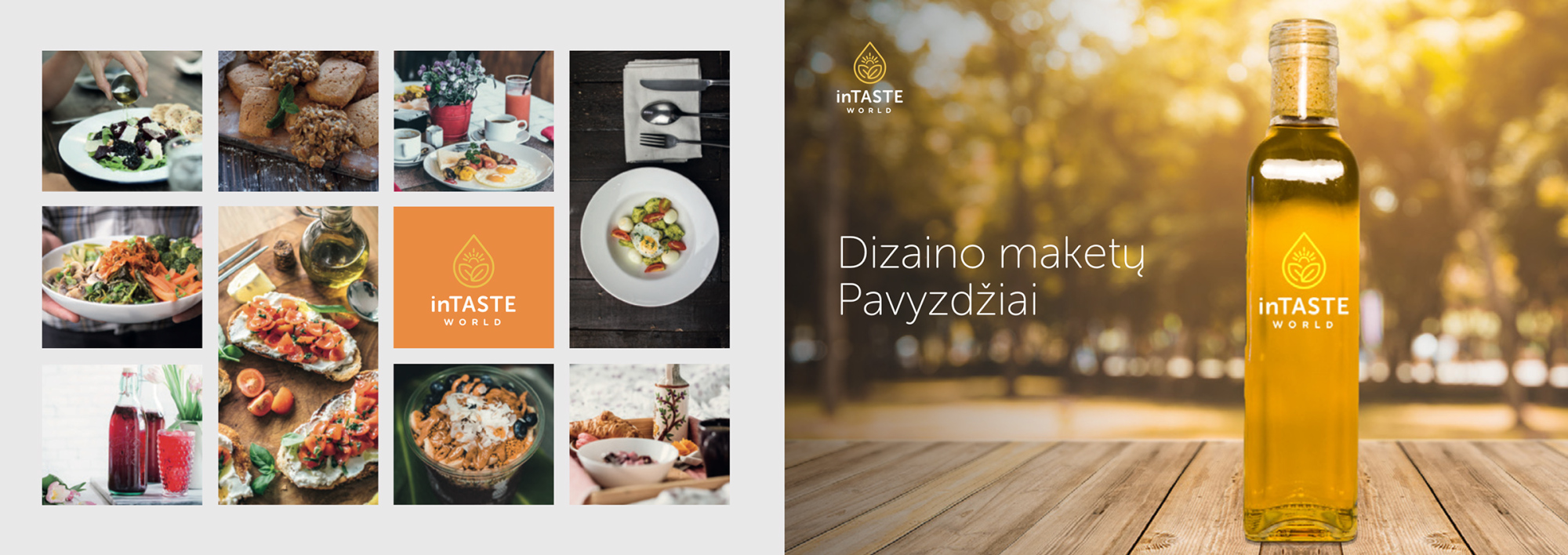
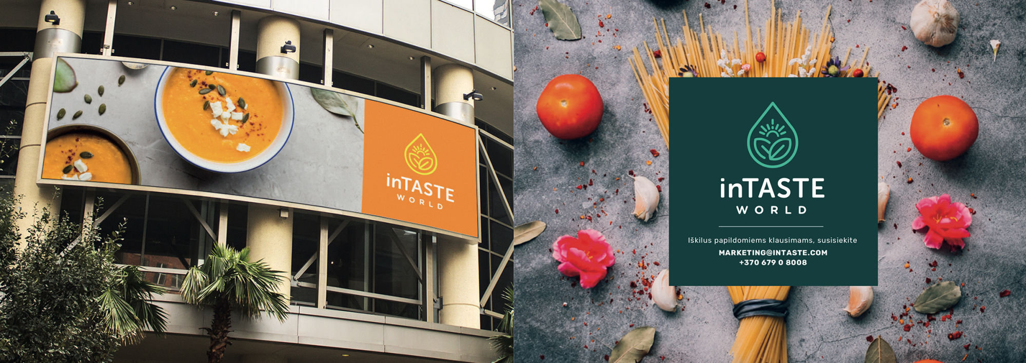
Various rules for design layouts were created to keep things consistent across both brands.
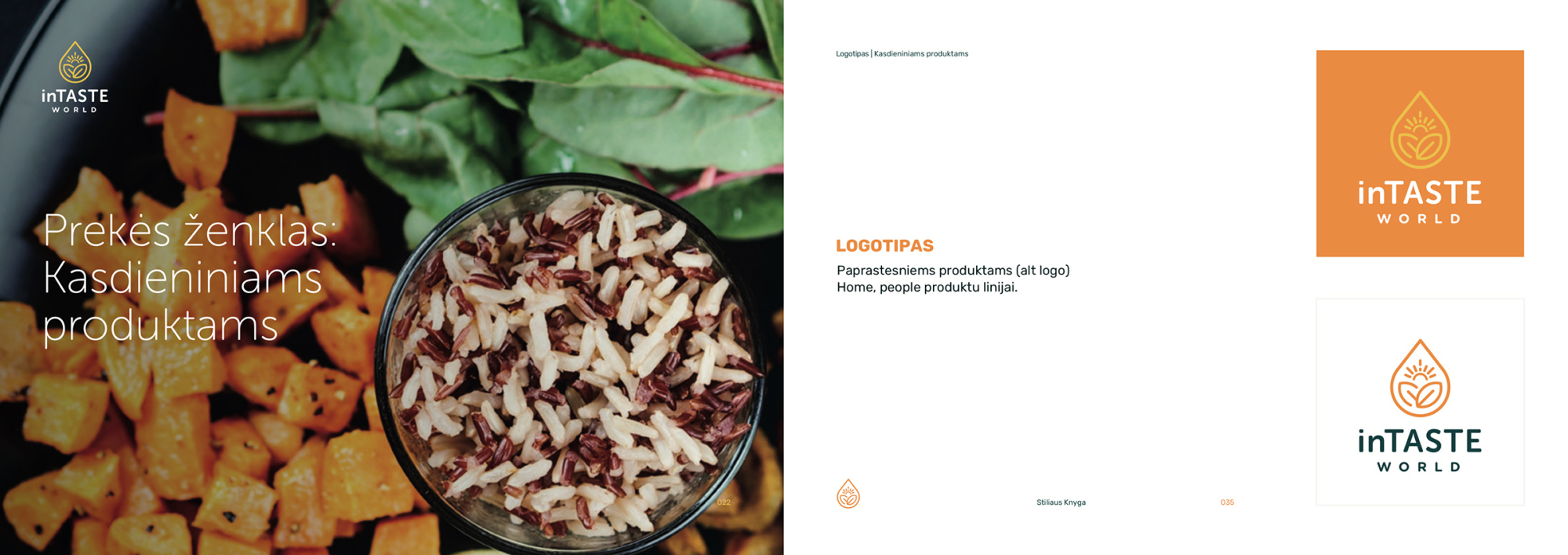
Along the inTASTE brand for chefs and restaurants that are offering luxury olive oil products, there was designed an "inTASTE for home" brand which has cozy colors and welcoming appearance for housewives or just people who like to cook with quality ingredients.
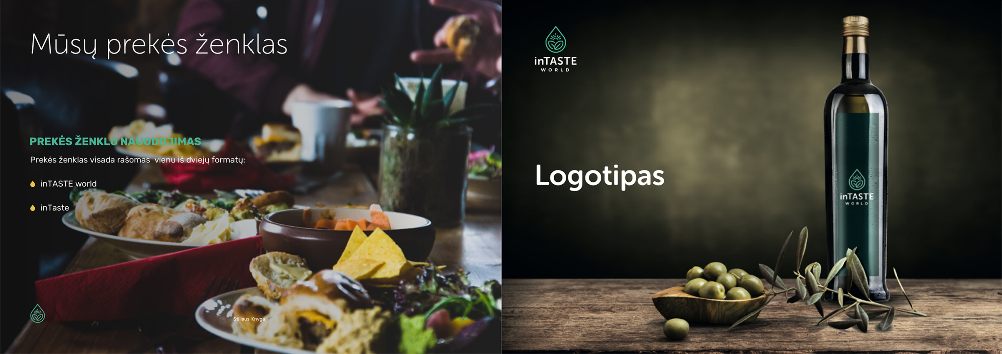
inTASTE - discoveries of world tastes
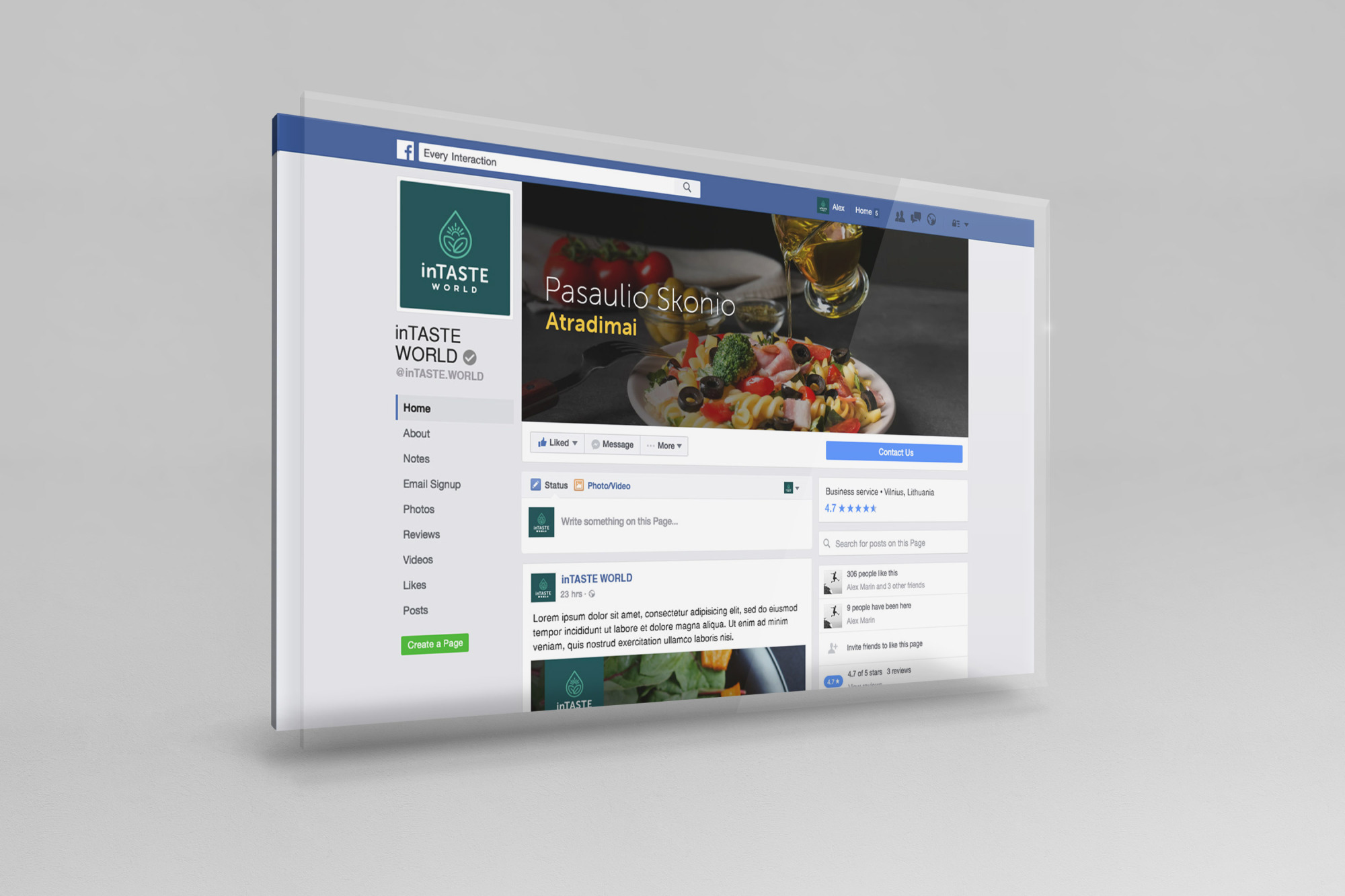
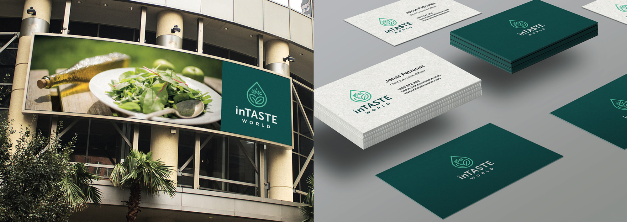
inTASTE is the brand about natural and pure tastes of the world and discoveries of it. I was asked to design this brand from scratch. The idea of the name, logo mark, fonts and colors everything was under my direction and inspired mostly by me. Clients goal is to sell handpicked, luxury and high-quality oils and spices from various countries. The main focus for the start is olive oils and the target is both - housewives and restaurant chefs. That's why I created inTASTE world (dark green) brand for luxury products and same brand having sub-brand inTASTE world (orange version) for products that are targeted more towards housewives.
Here is some more story behind this brand and its logo.
In order to obtain a high quality and genuine taste, fresh products should be used, and above all qualitative ones. This is what symbolizes the whole of the logo as a whole. The drop reflects freshness and certainty in the skewer and is symbolized by oil and other liquid-based products in your future.
The sun is the energy for food and our environment. The sun also symbolizes the positive energy of the sign. By combining everything, the sign dictates the freshness, freshness, certainty and, in part, the green tone. These days, everyone is trying to buy only genuine natural and unprocessed products, and that is one of the most reliable features of this brand.
The overall style of the logo symbolizes a hand-drawn style that gives the mark a ton of closeness and friendliness. Clarity and self-confidence are expressed through a minimalist design style that is untranslated and clear.